Tu demo gratis. Sin permanencia. Sin letra pequeña.

The image displays the logo for 'Healthy Poke', featuring bold, uppercase, sans-serif text in a deep blue color that reads 'HEALTHY POKE'. Below it, in a smaller, cursive-style font, the phrase 'HANDMADE WITH' is written, followed by a soft pink heart symbol, conveying a sense of care and artisanal quality. The design is clean and modern, set against a transparent or white background, emphasizing the brand’s focus on fresh, handcrafted food.

Caso Healthy Poke

Multiplicaron x4 sus reseñas en 2 meses

Tus clientes quieren dejarte una buena reseña Pónselo fácil.

La realidad duele: tus clientes felices se callan y los enfadados hacen ruido. Superpopi cambia las reglas. Un código QR y un juego convierten a esa 'mayoría silenciosa' en máquinas de reseñas de 5 estrellas. Sin suplicar y sin líos técnicos.

Paso 1: Un mensaje de Fernando, fundador de Superpopi 👇

Paso 2: Descubre como Superpopi puede multiplicar tus reviews en oogle

Negocios que ya no suplican reseñas.

Circular logo with a light mint-green background and dark teal text and graphics, featuring a central caduceus symbol above the bold uppercase word 'FARMACIA', followed by 'JAUREGUI' in smaller uppercase letters; the outer ring contains the text 'Bda. Ntra. Sra. del Carmen (Ctra. Cártama)' at the top and 'Avda. Ortega y Gasset, 28 Tlf: 952 33 18 56' at the bottom, with small decorative flourishes flanking the central text block; the design conveys a classic, trustworthy pharmacy identity with clean typography and balanced layout.
Healthy Poke logo (dark theme)
1767158989430-logo beone.png
Tierra Burrito Bar logo (dark theme)
1767159050618-lòrange_bleue-removebg-preview.webp
Circular logo featuring a stylized slice of cheesecake with caramel drizzle, set against a black and white diagonal striped background, encircled by a gold border with the text 'La Cheesegería' arched at the top and 'By El Caserito' curved at the bottom in elegant script font.
A bold, modern logo featuring the word 'XPECADO' in a vibrant yellow-orange color, rendered in a clean, sans-serif typeface with thick, rounded letterforms; the 'X' is stylized with intersecting diagonal strokes that extend slightly beyond the baseline, giving it a dynamic, energetic feel; the entire logo is set against a transparent background, making it versatile for various applications; the design conveys confidence and contemporary branding suitable for a business or product identity.
A minimalist logo design featuring a stylized frying pan with a yellow fried egg centered inside it, emitting small radiating lines to suggest heat or freshness, positioned above the word 'GASTROADICTOS' in bold, uppercase, sans-serif lettering with a slightly distressed or textured appearance, all rendered in white and yellow against a solid black background, conveying a modern, food-centric brand identity.
A stylized logo composed of three vertical colored blocks: teal on the left with a white uppercase 'S', orange in the center with a white uppercase 'A' that resembles a stool or stand, and yellow on the right with a white uppercase 'O'. The letters are bold, sans-serif, and centered within each block, creating a clean, modern, and segmented typographic design.
A stylized logo for 'Rodrigo Embutidos' featuring bold red and black typography with a dynamic, hand-drawn aesthetic; includes a central emblem with abstract geometric shapes and two horizontal bars flanking the text, all rendered in a clean vector format with precise linework and color contrast for high visibility.
Circular logo with a wood grain texture background, featuring bold black text that reads 'STREET WEAR' arched along the top, 'WOODTOWN' centered in large block letters, and 'est. 2015' at the bottom, all enclosed within a black scalloped border with dotted inner lines.
A minimalist logo featuring the word 'sano' in a bold, modern sans-serif typeface rendered in dark gray, positioned to the left of a bright lime-green heart icon with a subtle white diagonal stripe across its center, all set against a clean white background for high contrast and visual clarity.

Resultados reales. Sin milagros

x4

más reseñas en Google

4.8/5

nota media global

63%

de mejora en su rating

"Puedo decir que llevamos más de dos años ya en colaboración con Superpopi y que ha sido una pieza clave y fundamental para hasta cuatriplicar el número de reseñas en Google por local de manera mensual"

1767261354225-healthy_poke_logo.jpeg

Javier González

Director customer experience en Healthy Poke

No es magia, es un método.

Te mostramos el caso real de “Sabores” y los 4 pilares que garantizan un crecimiento real y seguro para tu negocio.

Solo clientes reales

El sistema se activa con el ticket de compra. Así garantizamos que cada reseña es de un cliente real, sin valoraciones falsas o de competencia.

Legal y certificado

Metodología auditada por Écija Abogados, expertos en derecho digital. Cumples con toda la normativa y te olvidas de cualquier problema legal.

Autoridad asegurada

Sin atajos. Construyes una reputación online genuina y sostenible que el algoritmo de Google valora, dándote más visibilidad a largo plazo.

Respeta a tus clientes

El proceso es un juego voluntario y divertido para el cliente. Sin sentirse presionado, lo que refuerza su buena experiencia con tu marca.

Tu reputación online no refleja cómo es tu servicio

¿Te suena familiar alguna de estas situaciones?

El cliente feliz no opina

Se va encantado, pero se olvida de dejar la reseña cuando sale por la puerta.

Pedir reseñas es violento

Sientes que molestas al cliente y tu equipo odia tener que hacerlo.

Un hater te baja la media

Una sola mala reseña tiene más peso que diez clientes satisfechos.

Google te ignora

Sin reseñas nuevas a diario, el algoritmo te vuelve invisible.

Domina tus reseñas en 3 pasos

#1 Escanea y juega

1767163492642-QR.png

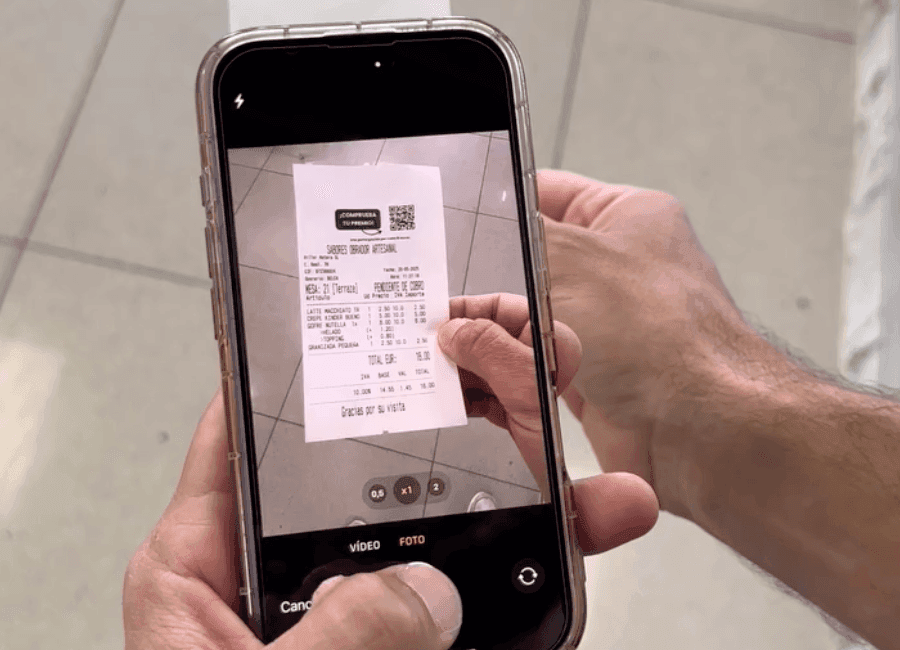
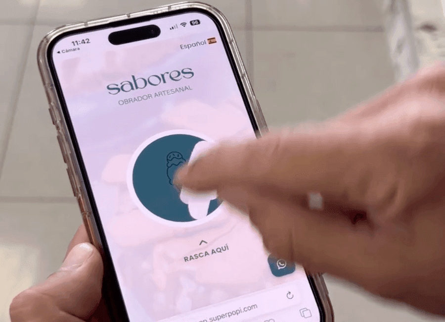
Tu cliente escanea un QR en su ticket. Sin descargar ninguna app, accede a un juego rápido. Cero fricción.
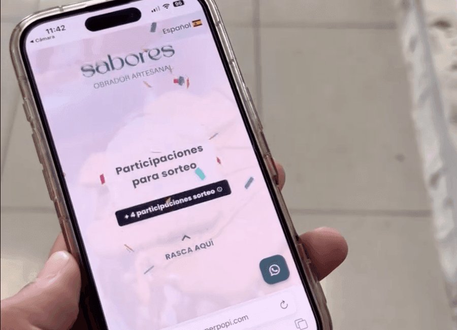
#2 Gana un premio

A close-up of a hand holding a smartphone with a clear protective case, displaying a mobile interface for the brand 'sabores OBRADOR ARTESANAL' in Spanish, featuring a circular teal scratch-off element with a small ice cream icon and the instruction 'RASCA AQUÍ' below it; a finger is actively scratching the surface, revealing part of the hidden content, while the phone’s status bar shows 11:42, 96% battery, and a Spanish language setting, with a WhatsApp icon and URL fragment 'superpopi.com' visible at the bottom.

El cliente siempre gana un pequeño premio (un café, un descuento...). Generando gratitud y reciprocidad.

#3 Consigues 5 estrellas

A close-up of a hand holding a smartphone displaying a mobile raffle interface for the brand 'sabores OBRADOR ARTESANAL' with confetti graphics, featuring the text 'Participaciones para sorteo' and a button labeled '+4 participaciones sorteo', along with a 'RASCA AQUÍ' prompt and a WhatsApp icon in the bottom right corner, set against a soft pink textured background with scattered confetti elements, while the phone’s status bar shows 11:42, 96% battery, and Spanish language setting.

Invitamos a los clientes a dejar una reseña. El 90% te dejarán 5 estrellas sin que tengas que pedírselo.

Sin permanencia y sin sustos

GO! Plus

Para empezar a facturar

25€

/mes

Te das de baja cuando quieras

Dispara tus reseñas de 5 estrellas

Filtro automático sin tramposos

Salga primero en búsquedas locales

Certificado legal sin multas

PRO

65€

/mes

Sin contratos de novios. Libertad total.

Todo lo del plan GO! Plus

Premios directos (recompensa inmediata)

Alianzas para captar tráfico nuevo

Aumente el ticket medio de cada cliente

Otras empresas ya lo han implementado

TASQUETA BLAI

WOODTOWN STORE

GIMNASIO
L´ORANGE BLEU

Y estos fueron sus resultados

1767263291072-unnamed (1).png

Alberto Álvarez Román

Dueño de Agencia

google

…la conclusión era siempre la misma, no funcionaba, y la demostración es que esas empresas ya no existen o se dedican a otra actividad.

Hasta que un día probamos Superpopi la aplicación de gamificación que funciona de verdad, y lo digo porque llevo años probándola, y sacándole el máximo jugo. Así que no puedo decir nada más que, si me estás leyendo, pruébala y compruébalo por ti mismo/a y cómo estoy seguro qué os funcionará

Lorem ipsum

1767263869890-unnamed (4).png

Jou Gameiro

Dueña de Woodtown

google

Muy contenta con todo el equipo que forma parte de Superpopi, muy majos y profesionales, están en todo momento atendiendo cualquier duda que tengas. La aplicación me parece fantástica para el comercio local, como apoyo, ya que genera en el cliente un momento divertido cuando participa y la felicidad de llevarse algo, y eso genera más ventas y sobre todo el detalle de alcanzar reseñas sin pedirlas directamente , aconsejo al 100% la aplicación

1767263456037-unnamed (2).png

Alex Ferrer Calvo

Project Manager L’Orange Blue

google

Desde que implantamos el sistema de gamificación en l’Orange bleue, hemos notado una mayor fidelización de nuestros socios y un ambiente mucho más motivador. Además, la colaboración con negocios locales nos permite premiar a los clientes y crear comunidad. Todo ello con procesos estandarizados que facilitan el día a día. ¡Una herramienta eficaz y con impacto real!

Lorem ipsum

la verdad que desde que instalamos Superpopi nos está sirviendo para varias cosas. La primera para fidelizar al cliente, ya que el cliente sí o sí en cada una de sus compras se lleva un regalo. La segunda porque al final, gracias a esa fidelización del cliente, Este está contento con el trato, con los servicios, con los productos y nos deja en reseña en Google, que hace que también nuestro posicionamiento sea mucho mejor en cada una de las ciudades en las que nos encontramos.

1767263685969-unnamed (3).png

Benito Sánchez

google

He triplicado las reseñas de mi restaurante en apenas 6 meses. Y he subido la nota un par de puntos.

Preguntas frecuentes

Deja que las reseñas de 5 estrellas lleguen solas.

Cuesta menos que un café al día y no tiene permanencia. Sin sustos.

SuperPopi. Todos los derechos reservados.

A bold, modern logo for Tierra Burrito Bar featuring the word 'TIERRA' in large, uppercase, orange sans-serif letters arched across the center, with 'BURRITO BAR' in smaller uppercase orange text beneath it, flanked by two small orange dots; the entire design is encircled by a thick, broken orange ring against a solid black background, creating high contrast and visual impact.
Circular logo featuring a stylized slice of cheesecake with caramel drizzle, set against a black and white diagonal striped background, encircled by a gold border with the text 'La Cheesegería' arched at the top and 'By El Caserito' curved at the bottom in elegant script font.
Circular logo with a light mint-green background and dark teal text and graphics, featuring a central caduceus symbol above the bold uppercase word 'FARMACIA', followed by 'JAUREGUI' in smaller uppercase letters; the outer ring contains the text 'Bda. Ntra. Sra. del Carmen (Ctra. Cártama)' at the top and 'Avda. Ortega y Gasset, 28 Tlf: 952 33 18 56' at the bottom, with small decorative flourishes flanking the central text block; the design conveys a classic, trustworthy pharmacy identity with clean typography and balanced layout.

+60 negocios ya lo usan en España

Loading...